Building Symplast's Design System
How I audited an undocumented product, established design foundations, and cut design time from days to minutes.
— PROJECT NAME
Symplast Design System Creation
— MY ROLE
UI/UX Designer
— TEAM
Jeff Gates
Greg Hartle (Chief Product Officer)
Scott Leachman (UX Designer)
Anton Vakhrushin (Front End Developer)
- DATE
08/2022- 06/2023
The Problem
No system. No source of truth. No way to move fast.
When I joined Symplast, one of my first asks was simple: show me the design system. The answer surprised me — there wasn't one. No component library. No typography guidelines. No icon system. What existed was a disorganized folder of icons with no naming convention, no categories, and no logic. Finding a single icon to complete a design could take hours.
After asking why a mature product had no design documentation, I learned the company had historically leaned on contractors, and the one in-house designer they did have simply never had time to document anything. The design knowledge lived nowhere — or everywhere at once, scattered across old files and tribal memory.
"I didn't know what font to use. I didn't know what font size to use. I couldn't find the icons I needed. It was nearly impossible to do my job properly — and I knew that if I was struggling, every designer after me would too."
Getting Started
Before building anything, I needed to understand what already existed.
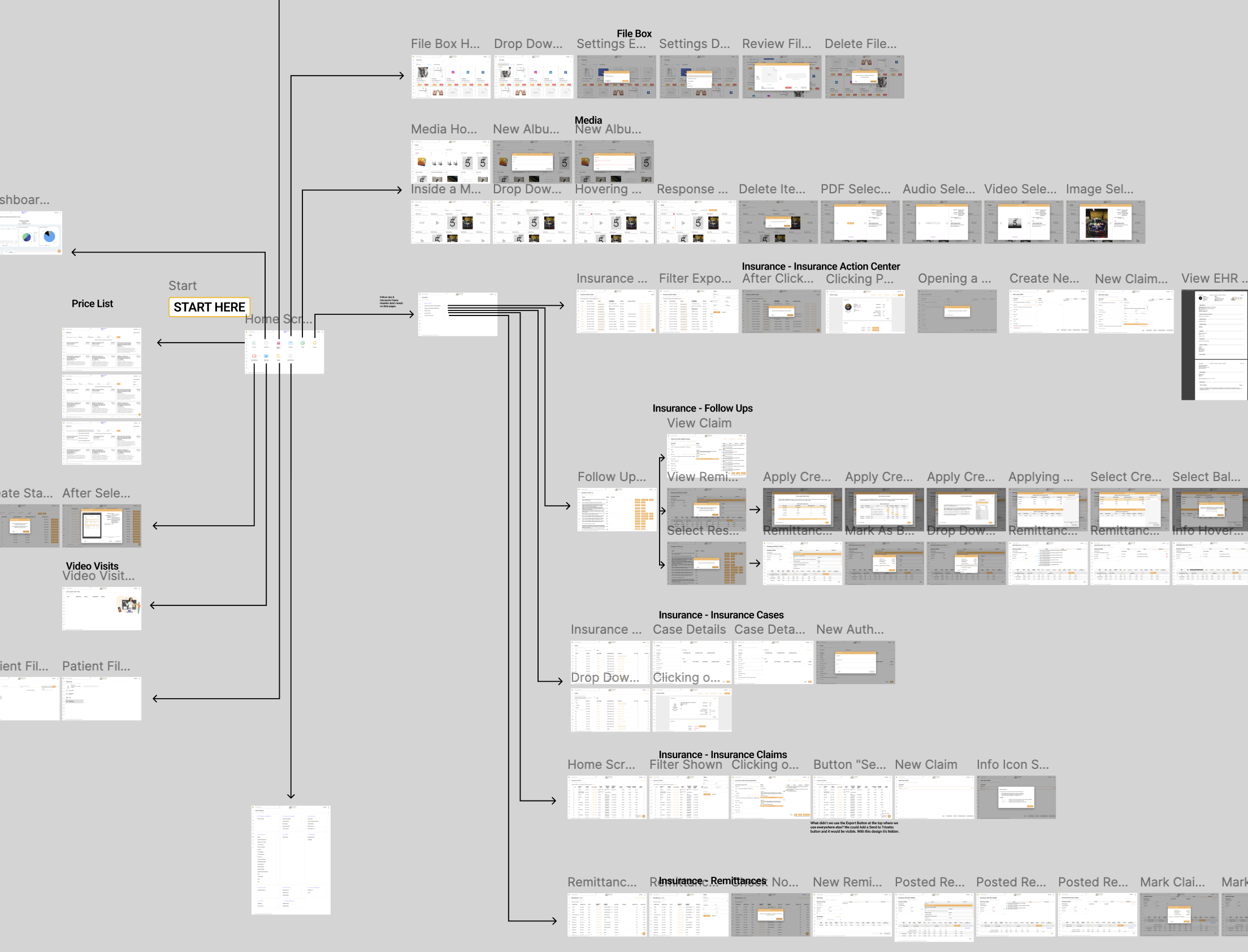
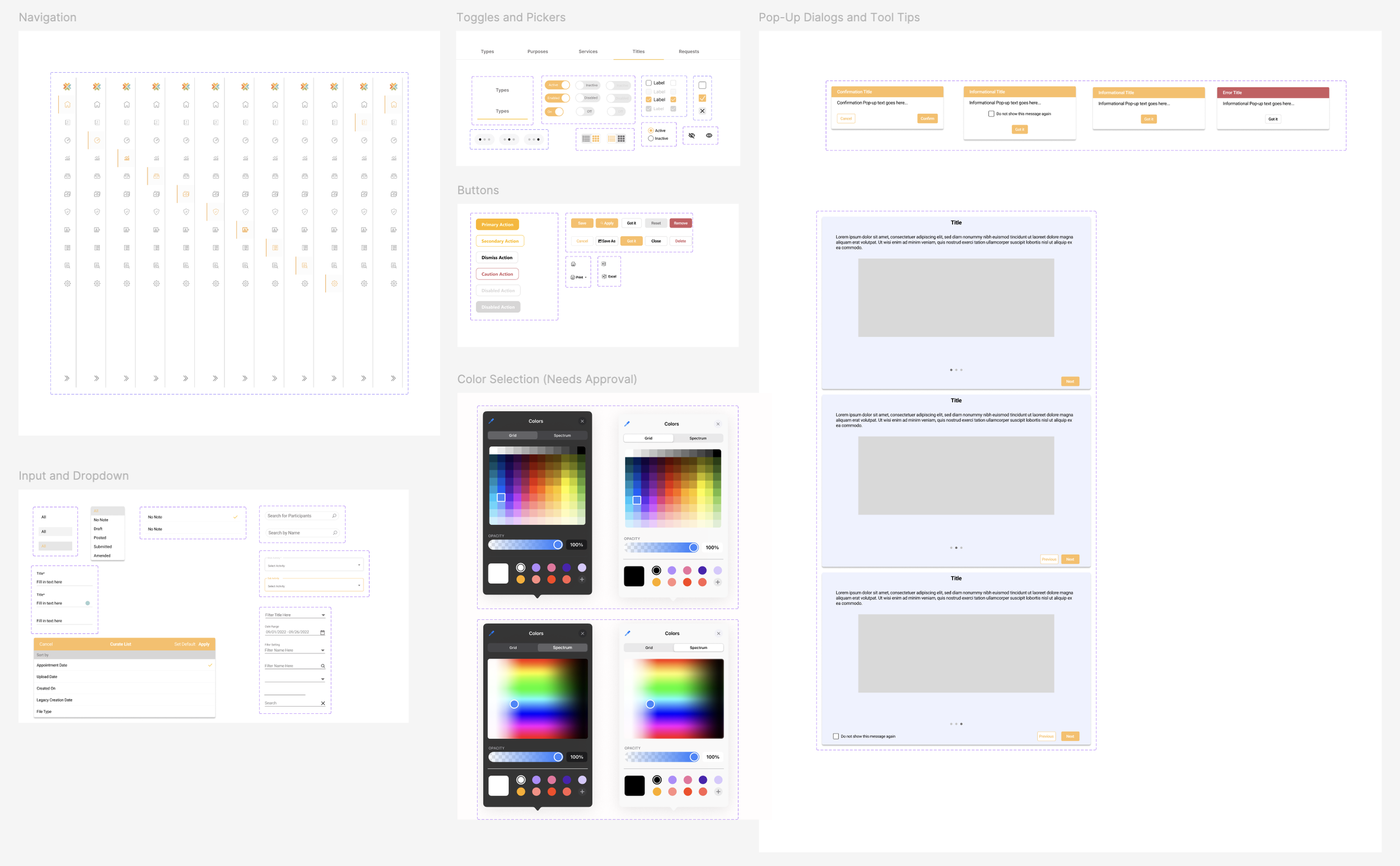
Rather than guessing at what the design system should contain, I started by mapping the entire product. I took screenshots of every screen and interaction and laid them out in a large Figma file — a visual web of the full software. Seeing everything at once let me absorb the product quickly, spot what icons and patterns were actually in use, and — critically — identify inconsistencies that no one had formally documented.
Identifying Inconsistencies
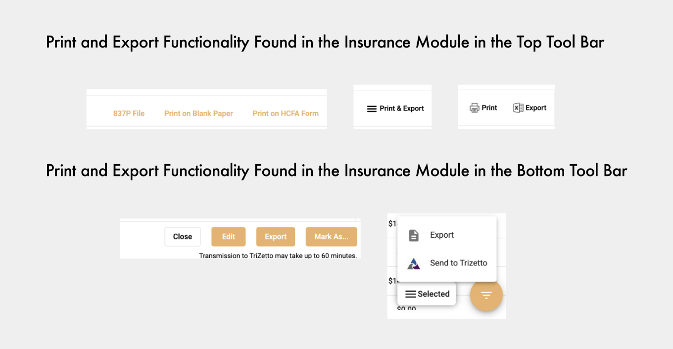
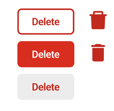
On some screens, print and export buttons sat in the top-right corner, while on other pages they were on the top left or bottom right of the screen. Some buttons were hidden behind icons that were being misused entirely. I also found that we had several inconsistencies with our delete buttons. I catalogued these issues and brought them to management and the development team so they could be addressed in future updates.
These inconsistencies happen naturally over time when a company relies heavily on independent contractors who don’t communicate with each other and don’t have a design system to refer to.
Ditching the Junk Drawer
The team had licensed icons from a specific designer but had no way to access them. They were downloaded long ago and placed in that disorganized file folder. Many icons were missing. Image previews of icons were too small to see without importing each individually, only to see what they were. It took me days to find what I was looking for, and there was no way this could stay the norm.
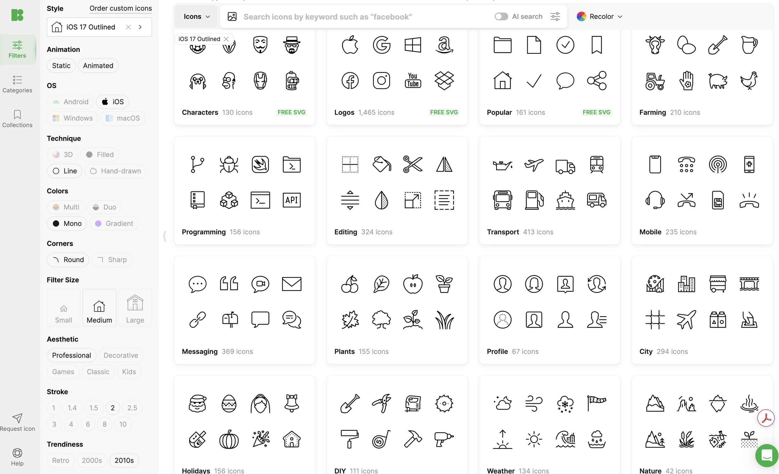
I researched the icon designer and found a Figma plugin that gave us access to the designer's full collection. After getting our company’s licensing code, I was able to log in and download all the icons that the product actually used. This was where the design system started to come to life. I was able to organize all of our icons into a Figma component library.
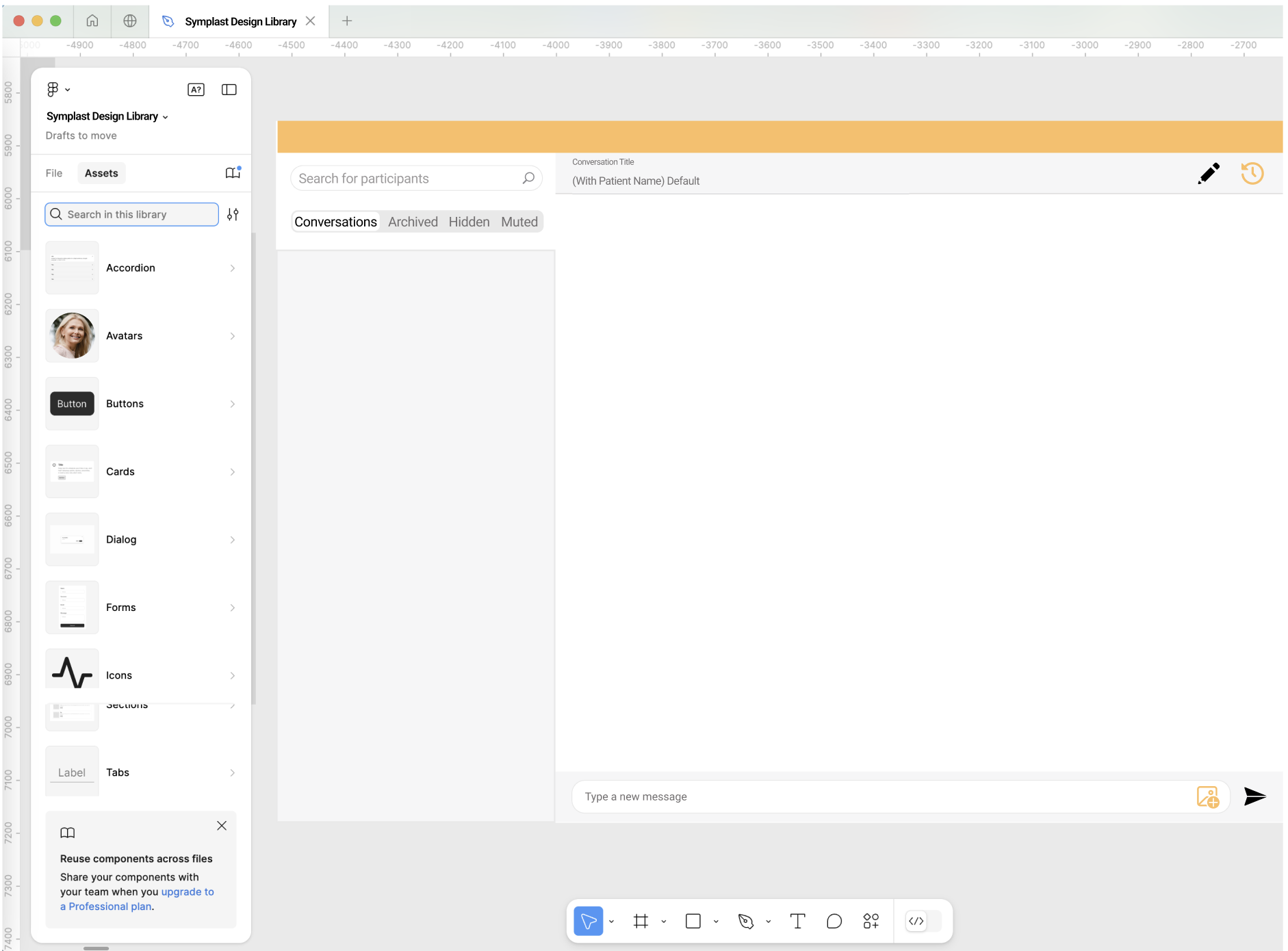
Creating the Components
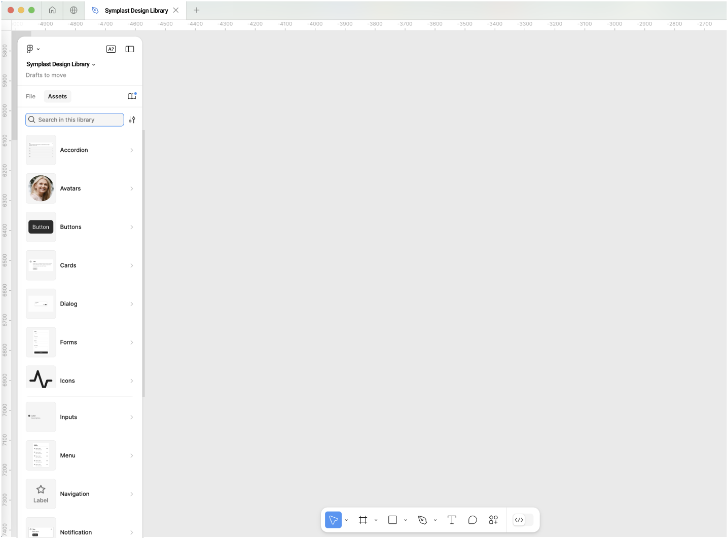
Using my product map as a reference and using the new library of components, I was able to recreate the real components from the software — not invented ones — and organized them into a shared Figma library with variants for each state.
Collaborating to Set New Standards
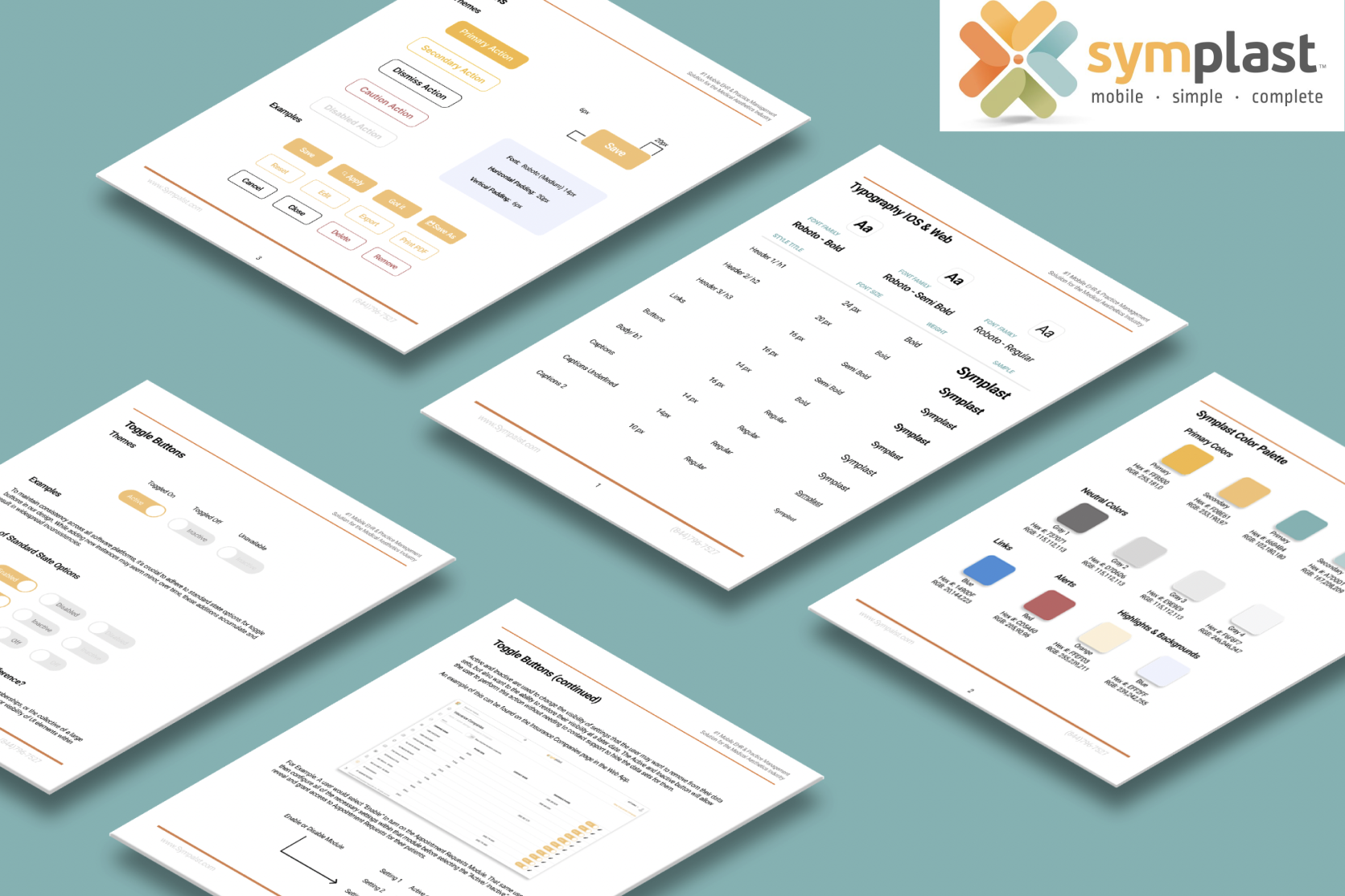
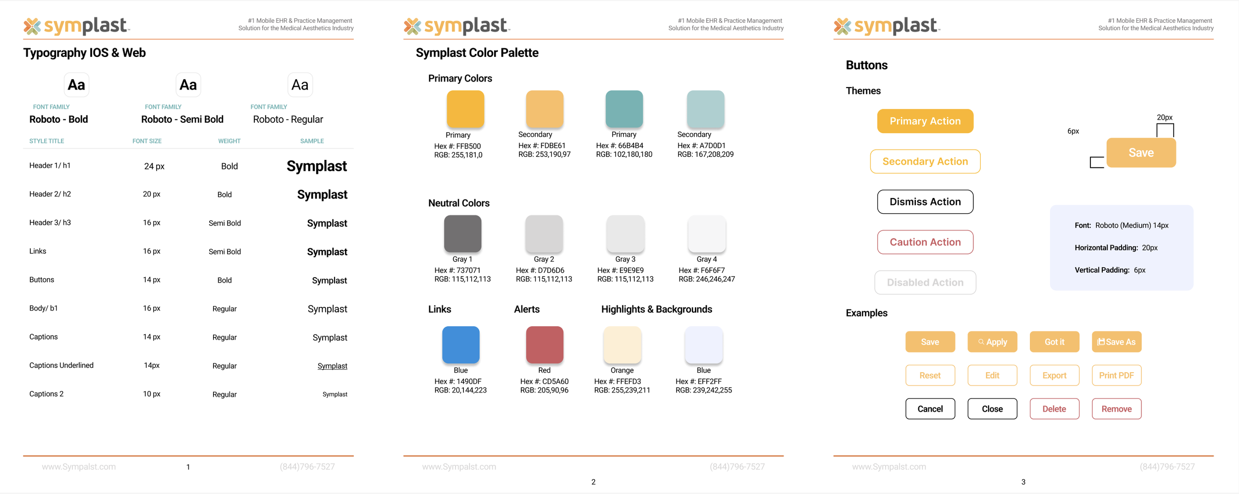
Using the company's existing logo, I extracted the hex codes from their colors to establish an official color palette. I then worked with the senior designer and a front-end developer to define the typography system — ensuring the type decisions were both visually consistent and technically implementable from day one. For this design system to work, we needed to make sure everyone was on the same page and had a buy-in to stick with this new system that would benefit us all and allow us to work more efficiently.
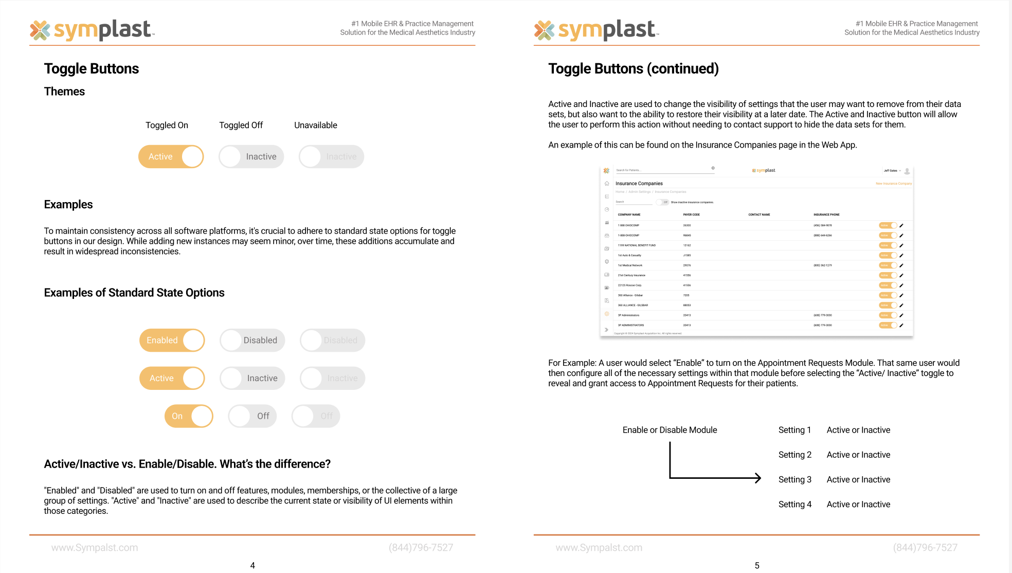
Together, we looked over all the identified inconsistent buttons I flagged earlier, and we agreed upon a new design standard going forward. The new standards were laid out in a PDF file shared with the whole product team.
“Do you think you could have those updates to me in a couple of days?”
“I actually finished them just now as we were talking. They’re in your messages now.”
Turning Days to Minutes
As I worked on more projects using the new design system, I began adding reusable page templates to the design library. Now, designers could start new projects from a real foundation rather than a blank canvas.
I had a Product Owner reach out to me to discuss some updates to our settings page. After about ten minutes of talking, they asked me, “Do you think you could have those updates to me in a couple of days?”
I laughed as I pressed send and said, “I actually finished them just now as we were talking. They’re in your messages now.”
That's what a good design system can do. It saves time, increases efficiency, and eliminates inconsistency. You stop reinventing the wheel on every new feature — because the patterns are already there.