
— PROJECT NAME
Insurance Module Redesign
— MY ROLE
UI/UX Designer
— TEAM
Jeff Gates
Moti Shimon (Project Manager)
Alexandria Sapigao (Project Manager)
Victor Barrios (Back End Developer)
Anton Vakhrushin (Front End Developer)
- DATE
01/2023- 03/2024
The Challenge
Symplast was originally built to be an all-in-one office management software that allowed Staff to make and track appointments, create and maintain patient files, and allow doctors to update patients’ charts and files as needed. An insurance module was partially built out by another team, but the project hadn’t been completed. Our task was to build upon the pre-existing work, update it, fill in the missing features.
Constraints
This project operated under significant constraints, including evolving requirements, shifting priorities, and limited access to reliable domain expertise early in the process. The team experienced multiple restructures and leadership transitions, which created challenges around continuity, decision-making, and long-term direction. Additionally, the complexity of healthcare insurance workflows introduced regulatory and technical considerations that required careful design tradeoffs. All of this took place under tight timelines, which increased pressure to move quickly while still striving to maintain usability and design quality.
Updating Claims History
To keep this case study focused, I’m highlighting a few key improvements that show how I approach UX problems and design decisions. One of those improvements was the Claim History experience.
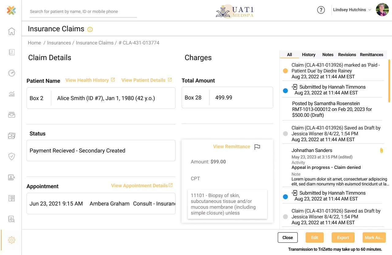
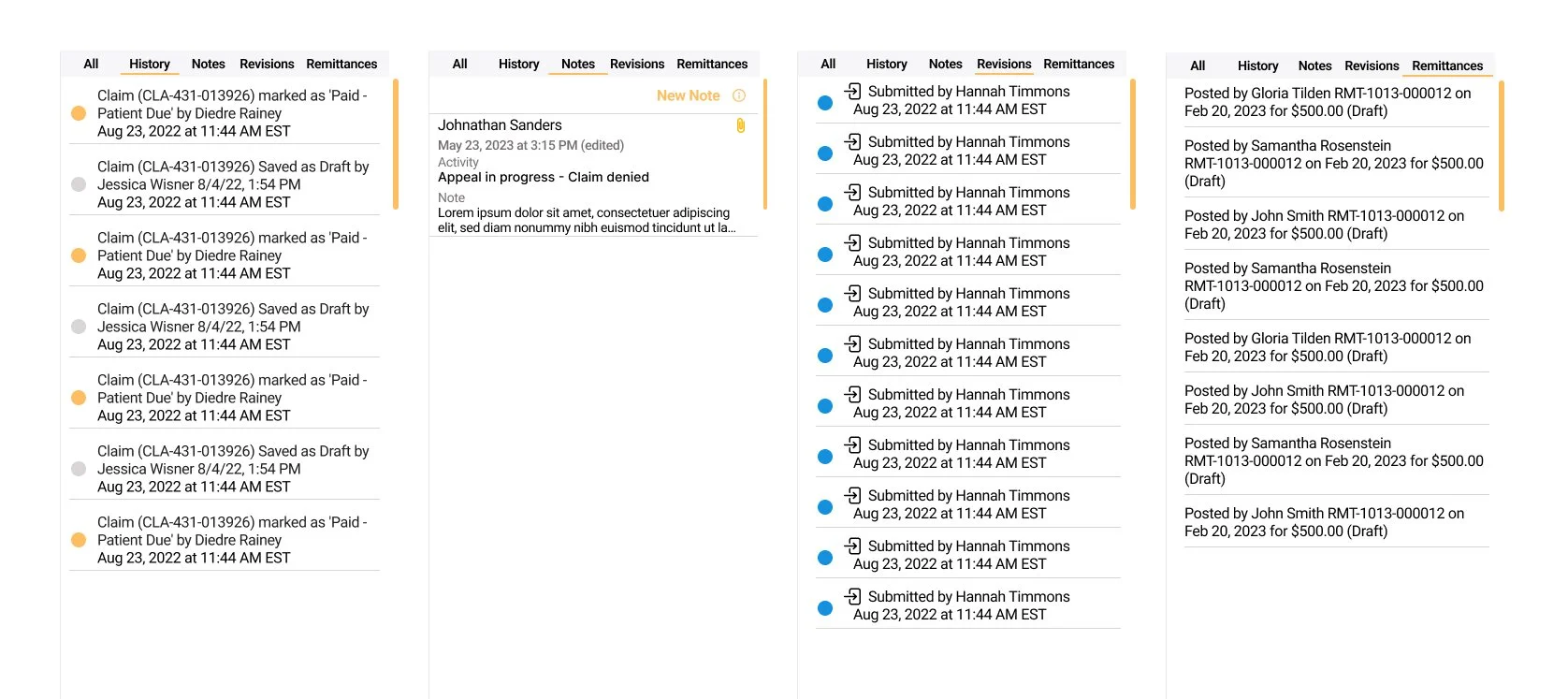
When a user opened a claim, the history section only showed who had last worked on the claim and when. While helpful at a glance, it didn’t provide any real context about what changes were made or why. I redesigned the history section to include meaningful details such as notes, remittances, and revisions made to the claim. I also included a filter at the top of the section to allow users to view only what they were looking for and cut down on unnecessary scrolling. This gave users better visibility into what had happened previously, reduced confusion, and helped teams pick up work more confidently without needing to track down context elsewhere.
Claims History
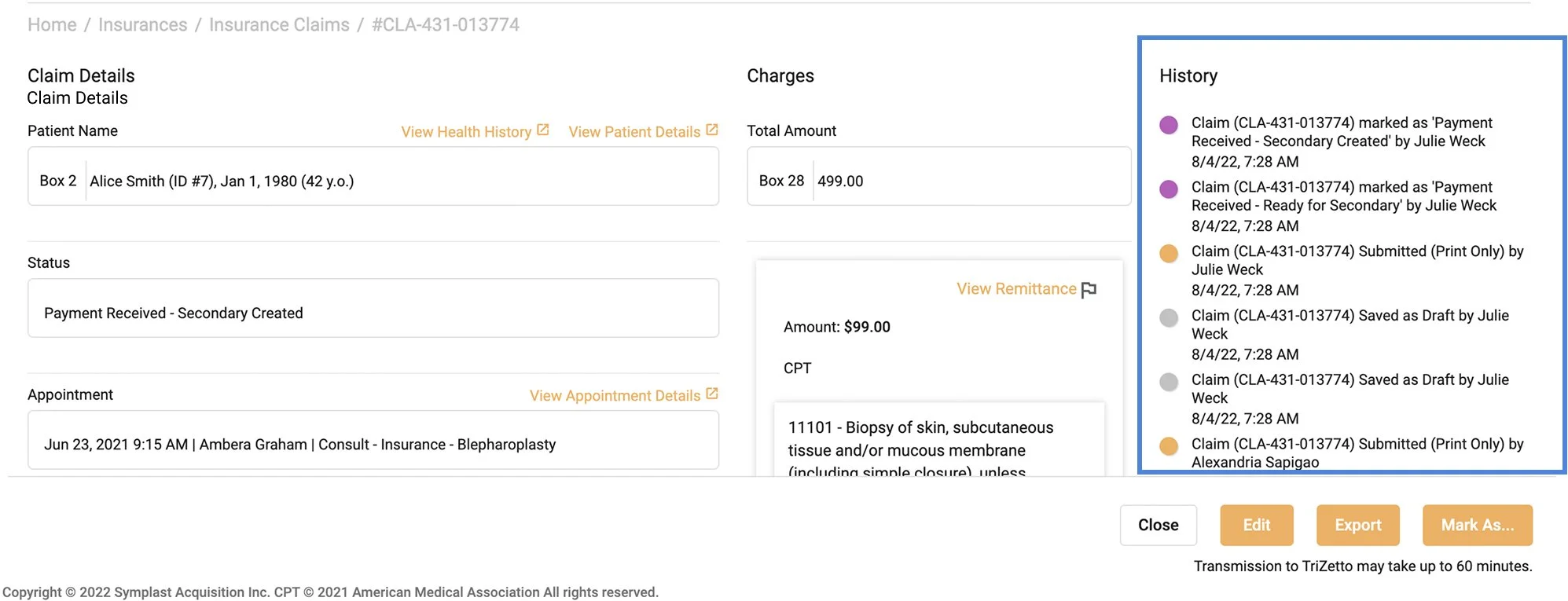
The Original Design
Originally, the historical records of changes and interactions made to claims were all together and weren’t easily identifiable. Users had to scroll through and visually scan all the data to find what they were looking for, and weren’t able to separate the types of interactions made to track previous interactions for better insights.
The Updated Design
Users can now filter the history of the claim to reduce their scrolling and only view data relevant to their search allowing them to gain better insight into whatt happened with the claim.

Driven by curiosity and built on purpose, this is where bold thinking meets thoughtful execution. Let’s create something meaningful together.

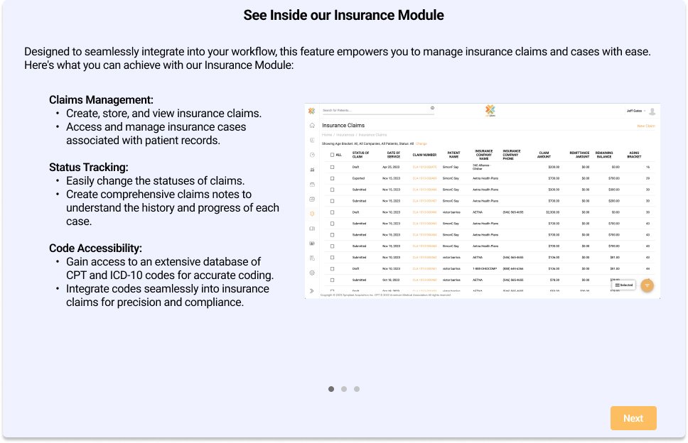
Inside Symplast Insurance
Outcome & Reflection
This project had a lot of moving parts and more than a few setbacks along the way, but we ultimately delivered a solid foundation for the Insurance module. Navigating shifting priorities and unclear requirements pushed me to stay flexible, communicate clearly, and keep the user experience grounded even when things felt messy. Despite the challenges, I’m proud of the design work that came out of this project and the way I was able to bring structure to a very complex problem space.
If I were to approach this project again, I would prioritize connecting earlier and more directly with an insurance expert and people who work with insurance claims every day. Sitting down with real users to understand their workflows, frustrations, and pain points would have helped ground design decisions sooner and reduced some of the rework later in the process. That’s a lesson I’ll carry forward into future projects, especially in complex domains like healthcare.